This semester, there are a multitude of new things that I have learned thanks to Professor Barbara Nixon. I have gathered together a list of the things I found most important throughout the semester.
Top 10 Things I Learned in PR Practicum
2 12 2009Comments : Leave a Comment »
Categories : Practicum
Brochures
29 11 2009In Chapter 7 of the textbook Strategic Publications: Designing for Target Publics by LInda P. Morton, the author goes through the in’s and out’s of designing a brochure.
1.) “The first step is to make format decisions including paper size, number and type of folds.” Decide in what way you will distribute your brochure. If you want to send it through the mail then you will need to make sure it meets mailing regulation sizes. A typical business envelope is 9 1/2 by 4 1/4 inches, so one will need to make sure that the brochure will easily fit inside.
2.) The second step is to “decide on the number, shape and treatment of panels. Each side of a fold is called a pannel.” The book talks about four different ways you can fold a brochure:
- The first is called a gate fold. This is where the inner section is twice as big as the outer two. As you can see in the picture below, this type of fold opens like a gate.
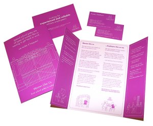
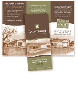
- The second type is called a tri-fold. This is the most commonly used way to fold a brochure. The right panel will fold over the inside panel, and then the left panel over the right, as show below. Chances are if you have ever picked up a brochure, this is probably the type you have looked at.
- The third kind is a french fold. This is where the paper is folded in fourths and opens up like you would a map.

- The fourth kind of fold the book talks about is a book fold. Which is folded in half like a book.
There are a number of other ways to fold a brochure that the book does not talk about. Here is a link to many other folding options.
3.) The third step “is to select margin and gutter options and add them to your comprehensives.” You want even margins on each panel and you will need to make sure the words to not get folded in the panels. “Allowing an equal margin on each side of folds, results in the gutters between each panel being twice as large. The following suggestions help to avoid this problem:”
- “Trim the outside edges of the paper after it’s printed so that doubling outside margins leaves small gutters at folds.”
- “Treat every other panel as a bleed so that the entire gutter is folded to go with surrounding panels.”
- “Treat panels that are viewed together as spreads that cross gutters.”
4.) The fourth step is to determine and prioritize the brochure’s content. Choose the most important information and place that on the cover panel and work your way down from there.
5.) The fifth step is to create thumbnails of how you want your brochure to look. Make sure you make multiple thumbnails so you can choose your best design. This is almost like doing a pre-rough draft. You can eliminate some of your biggest design problems by simply laying out your design before you actually start on the brochure itself. Keep in mind the multiple design elements such as :
-Unity- the ability for all itmes in a layout to appear as one visual unit
-Alignment- refers to the layout of items along invisible but easily identified lines.
• “Horizontal alignment places emphasized items of a layout straight from left to right, creating a visual line horizontally on the page.”
• “Vertical alignment places emphasized items of a layout straight fromt op to bottom, creating a visual line vertically on the page.”
• “Diagonal alignment places emphasized items of a layout from a high position on one side to a ow position on the other side, creating a visual line diagonally on the page/”
• “Curved alignment place emphasized items of a layout in a curved pattern often outlining curved art. This creates a visual curved line on the page.”
-Proximity- refers to unifying items by placing them physically close on a page.
-Harmony/Consistency- refers to treating items similarly on a page or throughout publication.
-Direction- refers to using design items to direct the eye from one item or unit to another
-Proportion- the size relationship of one item or unit to others or to the whole.
-Contrast- the element that permits one item to stand out clearly from others.
-Rhythm- suggests a flowing quality and assists readers’ eyes in moving from one item to another.
-White Space- frames and helps hold the design together.
Quotes gathered from Strategic Publications: Designing for Target Publics
Comments : Leave a Comment »
Tags: Brochures, Linda. P. Morton, Strategic Publications: Designing for Target Publics
Categories : PRCA 3339
Informational Interview with Brett Pohlman
4 11 2009In PR Practicum (PRCA 3711/4711) with Barbara Nixon, we were assigned to conduct an informational interview with a PR professional. Using Twitter, I found Brett Pohlman who allowed me to ask him questions over the phone.
Sarah: “What is a typical week like for you?”
Brett: “For me, I manage a lot of social media for clients–their facebooks, twitter, and provide a lot of strategy to those clients. The customers/consumers drive what I do on a regular basis”. Brett explains how their largest client is Baskin Robbins. “I manage their twitter and handle and respond to customers online, depending on what they tweet about and say about Baskin Robbins” He also manages their facebook fanpage by putting out new products, pictures, and videos, as well as all kinds of new information. He also works a lot with RFPs, which is a request for proposal. “Anytime a client submits this, we decide if we want this client. We research them and look at their brand as a whole and see what we can do with them in social media. I research a lot and keep abreast of what is going on in social media. One minute twitter is in, and the next minute it could be out.” Brett explains how the industry is very fast paced and that you never know what is going to come next, so nothing is ever completely typical.
Sarah: “Tell me about a project you worked on that you are especially proud of.”
Brett: “Back in April, we had our 31 cent scoop night at Baskin Robbins.” He explains how the store has over 12 or 1300 individually owned franchises throughout the country. “For us to do a national program like this is really big because our computer systems aren’t all hooked together, and not all franchisees are hooked together”, says Brett. They did a huge push with the mommy bloggers online. “Since Baskin Robbins is such a family oriented, ‘let’s go with your kids to have ice cream’ kind of brand, families and moms are a huge target audience and mommy bloggers so active on facebook and twitter now. They embraced it, shared it on their networks, and at the heat of the moment, right there leading up to the night, we had just about 20 tweets per minute that were going on about Baskin Robbins.”
Sarah: “How important is writing in your career?”
 Brett: “Extremely important. I wish I would have payed a lot more attention in my pr writing course. The pr writing course, for me, was one of the hardest, but I learned the most out of that course. In English classes and your freshman and sophomore years, you’re trying to write a lot of wordy sentences. Pr writing is completely the opposite—straight and to the point with no excess information. To be able to do that very well will keep you employable for the rest of your life. There is always a need for good writers. I can’t tell you how much we end up giving to a copywriter, or someone that does it full time, vs. keeping it in house. And yeah we’re good writers, but writing also takes up a lot of time….if you can write, you will get hired. It’s pretty much a done deal.”
Sarah: “What three tips would you offer someone just starting out in PR?”
Brett: 1.) “Be involved with social networks as much as you can; that is literally the future. My professor at auburn was always telling us that. Within the last 2 year, things have changed so much- take Twitter, for example. Almost everyone is on it or at least trying it out.”
2.) ” Try to think outside the box. I know that’s not always easy, but too often students will just regurgitate what their professors say to them or how their professors teach them. We want you to go further than that and really put in that extra thought. Even if you’re blogging for a class, put in that extra information. When you can drop names and start reading and showing that you’re involved, that’s when we really start to look at you like a new hire. You’re putting your own opinion in that.”
3.) “Whatever you do, do it very passionately. I think that you can do whatever kind of pr genre that you want, and I think that is really easy…especially in pr and in social media. It’s really easy to start writing a blog, or becoming an expert in a field of what you like. Take fashion for example, if you like fashion, you can become an expert in that field. There is enough social media within the fashion industry itself to learn everything you need to know.”
Sarah: “What do you do to keep current in your industry?”
Brett: “Get outside of the office. Too often I just work so hard and so much that to get outside of the office space and to get around to other thinkers is probably the best thing. In Boston we are very lucky because we have lots of tweet ups around the city about people in social media. I have a great arsenal of social media people within the city and to hear them speak and go to those events is great. Also, read blogs—all the big pr blogs.”
Sarah: “What do you wish you would have known before starting your career in PR?”
Brett: ““The strategy part of pr is what I really didn’t understand before I left college. I was very quick to regurgitate what Robert French was saying in my social media class and I was really good with keeping up with blogs and videos. But when you’re put in a real world situation, it’s really hard to start thinking of ideas about what companies should be doing. Be able to think strategically, that’s what will set you apart.”
Sarah: “What has surprised you the most about working with PR?
Brett: “For me, in my particular situation, I have been surprised at how much I have been able to do. I could have gotten a job where I sit in a cubicle and not have moved very far and not progressed as much. However, I went to a medium sized firm that’s going on its 30th year next year. Fortunately, my boss loves to help young people out and I got very lucky that I found this firm here in Boston. I think if you push people and you push your bosses and do a great job, they are going to reward you with getting more responsibility. In this economy, you really have to work hard.”
Sarah: “What professional organizations are you involved in?”
Brett: In school I was in PRCA and also became an officer. I also did a lot with UPC and was also involved in student government. Right now I go to a lot of social media breakfasts on a regular and am also involved with the Social Media Club, and the Advertising Club of Boston.
Comments : Leave a Comment »
Tags: Baskin Robbins, Brett Pohlman, public relations
Categories : Practicum
Dirty Jobs: Lithography
1 11 2009In Barbara Nixon’s PRCA 3339 we watched Dirty Jobs starring Mike Rowe. In the episode we watched, he was shown the process of creating a lithograph. “A lithograph is an authorized reproduction of a piece of artwork, map, or text that has been created using a distinctive printing process” (definition from ehow.com).
While most naturally think of the show to be one that involves intensely disgusting (almost gag-worthy) scenarios, this one proved to be somewhat different and actually far more interesting than the typical stomach turning episodes. “Why would we watch a television show such as this in a PR Publications class?”, one might ask. Well because publications involve works such as brochures, flyers, business cards, etc., lithography fits right in.
 At the beginning of the episode, the workers show Mike exactly what a lithograph is because many people do not know. Further throughout the show you find why this subject is on dirty jobs. He has to mix the colors for the lithograph, and this takes more work than one would think and, as the name of the show suggests, you get quite dirty. Another reason why this is on Dirty Jobs is because after the printing of the lithograph, there is a certain way one must take the paper out and if you do it the wrong way, you can hurt yourself, others, or multiple lithographs. This is a job where you must make sure everything you do is right. As the worker on the show explained, you must never make a mistake. So take into account his words, this is no “walk in the park” type of job! This is hard work.
The episode was quite entertaining and I recommend it to anyone interested in lithography.
Comments : Leave a Comment »
Tags: Dirty Jobs, ehow.com, Lithography, Mike Rowe
Categories : PRCA 3339
Photography
26 10 2009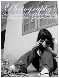 After completing the course “The Language of the Image” offered by Poytner NewsU, I was reminded about a great deal of information about photography. About two years ago, I took a photography course at Georgia Southern University and learned a lot about photography, but along the way had forgotten a lot of it. By taking this course, I was reminded of many of the elements of good photography.
To begin with, the course explains the different types of photos including information, passive and active. An informational photo is just as the name suggests. It is simply a photo that is for informational purposes; to show what a person, place, or situation looks like. A passive photo is one that is taken for a publication. It is when someone sets up the photo to make it look as pleasing as possible. Active photos are photos of situations that have actually taken place. Magazines and newspapers use this type of photography a lot. They are best for photojournalism because they show the situation taking place.
The course then goes on to talk about “single elements”. It goes through a number of vocabulary words and gives examples of pictures for each including graphic, quality of light, emotion, juxtaposition, mood, sense of place, point of entry, impact, rule of thirds, perspective, suprise, layering, moment, and personality portrait. (to learn more about these elements, visit http://www.newsu.org)
Next comes the topic of “multiple elements” within photography. This is when a photographer uses multiple elements that were mentioned above to make the story in the picture more interesting.
The last topic covered in the course is “different approach”. It talks about how there are opposite approaches you can take to photographic birth, drought, funeral, skulls, and swimmers. These each can be looked at from two different angles.
What surprised me while taking this course is that there are so many different ways to look at photography. I think that many people are fooled to believe that taking a photo is just basically pointing a camera and clicking, but in actuality, there are many things that should be taken into consideration when trying to take a good picture.
After completing the course, I would like to learn more about black and white photography.
Comments : Leave a Comment »
Tags: "The Language of the Image", Photography, Poytner NewsU
Categories : PRCA 3339
Putting Color In A Shape on InDesign
19 10 2009When one first gets introduced to Adobe InDesign, the program can seem quite complicated. There are so many different little actions that can be done that even the simplest of things can easily be forgotten or confused with other actions. What I would like to explain to you is how to put color in a shape as well as put color on the border.
1.) First, Open Adobe InDesign
2.) Then Create a new document
3.) Select a shape from the toolbar on the left (rectangle, ellipse, or polygon tool)
4.) Go to the bottom of the tool bar and double flick “fill” (It will be a white square with a red diagonal line through the center)
5.) A box will appear with a multitude of colors. Use this to choose the color for your shape
****To Put Color on the Outline of a Shape:
1.) Double click “stroke” (which will be to the right of the “fill” tool–it is a square with a black line around it)
And there you go! You have put color within an object and learned how to change the color of the outline of the object!
While these are simple steps, it is always helpful to have a reminder in the little process of things within these types of programs.
Comments : Leave a Comment »
Tags: Adobe, Adobe InDesign
Categories : PRCA 3339
Typography
28 09 2009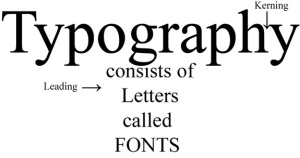
When a designer is trying to make a decision of which font to choose, they should “select font options that reinforce your key organization’s identity and deliver its key message effectively to the target public.”
Linda P. Morton explains that the best option is usually to use a more conservative font, however for Generation X and Y enter into the business field, less conservative fonts may become more popular for letterheads.
The typical font size for a business card is usually 7 points or under, but anything that fits on the 3.5 x 2 card will work as long as all of the necessary information is included.
For a brochure, the typical font size would be about 12, but at the same time it is appropriate to have a variety of font sizes depending on the design you choose.
There are actually many more fonts than InDesign shows you and most of them can be found on the internet. The best and most reliable (and legal) source to find tons of fonts is at dafont.com .
For directions on how to download fonts for both Microsoft and Mac users, please visit this site: http://www.computerhope.com/issues/ch000563.htm
For Questions about dafont.com, visit their FAQ page.
Strategic Publications: Designing for Target Publics by Linda P. Morton
Comments : Leave a Comment »
Tags: brochute, business card, dafont.com, Fonts, Linda. P. Morton, Typography
Categories : PRCA 3339
